
Role:
UX designer
Timeline:
Spring 2023
Team:
Erik Soriano
Ayushi C.
Tools:
Figma
Summary
ThriveWorks is an Incident Reporting System for nursing homes staff and administrators. The system allows for an easy way to fill out reports and cases, as well as the ability to track the status, append files, and facilitate communication between admins and staff.
Over the course of 5 weeks, our team performed secondary research on current Incident reporting systems, as well as used design techniques such as concept maps, ideation, sketches, user flows, etc. to innovate on the user experience of reporting incidents at the workplace.
The end result was a high fidelity prototype that shows a clean and intuitive interface for people to fill out reports as well as keep track of their cases progress.
Project Objectives
Design a new user interface for an error reporting system using human-centered design approach
Ensure that the system caters to user groups of all technology knowledge levels
Explore new ways to increase scalability so the system can work well whether there is 1 case or 100 cases being processed
Prioritize needs for both: nursing staff and administrators who use the system
My Involvement
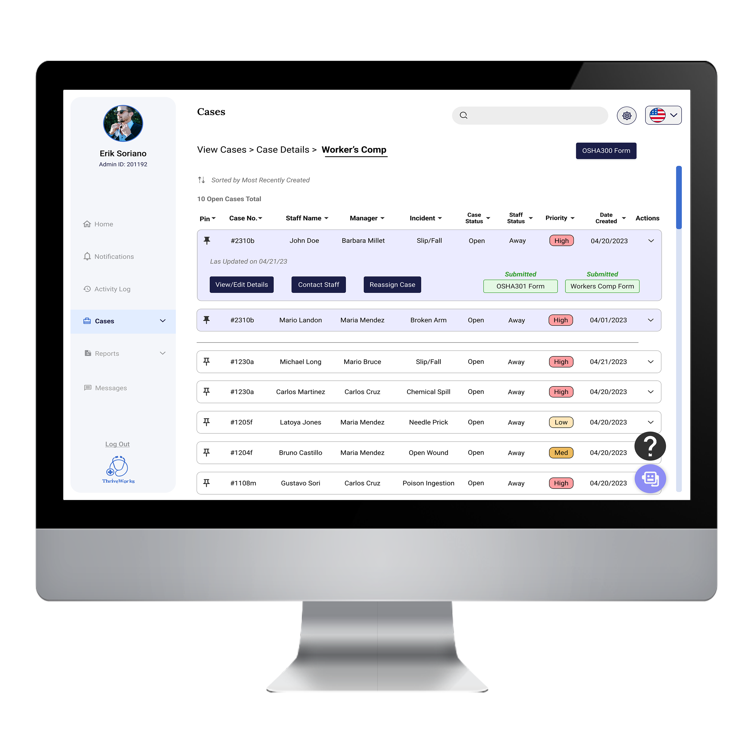
I worked on the user experience for filling out reports/create cases, reassign cases, populate and submit important forms (workers comp, OSHA forms) show dark mode, switching to a new language (content translated). Together we reviewed each other’s work to ensure consistency across the system design.
The Challenge
Redesign an Incident Reporting System that is shame and guilt free, has clean and aesthetically pleasing user interface, and minimizes under reporting at the workplace, by providing a robust user experience so that filling our reports and handling cases can be a painless experience.
My main task was how to make the experience of filling out forms as clear and intuitive as possible, and to avoid duplicated data entry to save time, as well as have clear indicators of where to go next and use hints for help, etc.
User Groups:
Nursing Staff
Nursing Home Admins
Specific Needs:
Save them time by eliminating duplicate data entry when filling out forms and reports/editing cases(For admins)
Need the ability to communicate with staff if any item is pending/missing in the report, and to continue with case
Need the ability to prioritize case handling, by pinning them for easy access, as well as using color coding for different case priority levels
The Solution
Utilize a blue color palette that promotes a trustworthy, and aesthetically pleasing design so the system looks high quality, and users enjoy the experience of filling out reports, checking case status, etc. Also the ability for nursing staff and admins to communicate via comments (that appear in the activity log timeline) or via private message.
A chatbot was added as well to aid for frequently asked questions, as well as guide staff/new admins in best practices for filling out reports, etc. and provide resources for information if needed.
Features:
Ability to create/edit report and save for later completion
Ability to pin any case/report to the top of the page for easy access
Ability to reassign cases from one admin to another, as well as include a custom message when sending the transfer request
A chatbot feature for frequently asked questions, and to get support when filling out reports/handling cases
Ability to switch languages for users who are not native English speakers (all info will be translated for review before submitting)
Research + Define
About Incident Reporting Systems
After doing secondary research about similar products, it was important to understand what the minimum requirements are, as well. as limitations that a system like this one requires, so that when staff or admins are filling out reports/cases, they’ve got all the information they need. It’s also imperative to create a shame and guilt-free application that encourages sharing as much information about the incident as possible.
The minimum product requirements are:
• Dynamic and responsive design
• Flexible; usable by all departments; of all technology levels
• Ability to switch to another language for people who are not native English speakers and feel insecure about filling out reports (underreporting)
• Scalability and sustainability (easy to code and maintain for developers)
• Seamless and intuitive user experience
Click here to view full document with secondary research (PDF)
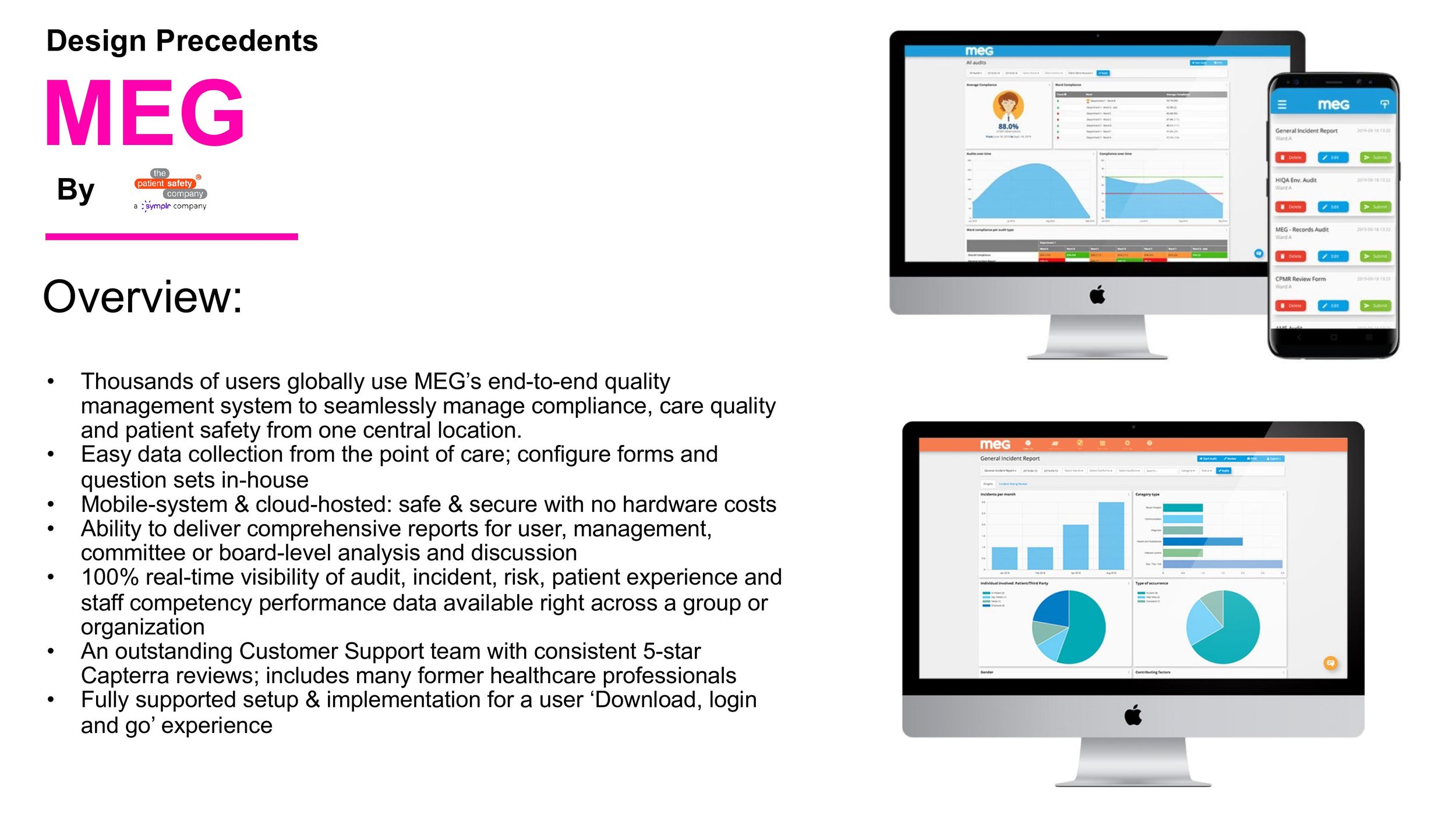
Design Precedents:

Concept Map
Identify minimum requirements
Discover areas of innovation and potential new features
Lay out design plan to refer back to throughout design cycle
(Click on image to expand)
User Flows
The system allows users to do the following tasks:
• Create and submit incident reports (both staff and admins)
• View repository of submitted/draft reports before they become cases
• View Case status as well as ability to append necessary files, and leave notes
• Reassign cases across admins
• Populate OSHA301/Worker Comps forms from the info on the report
• View case timeline of events and activity log
Flow for an admin creating a new case and processing OSHA forms. Exploring a potential “hint” system that could help a new admin during the case creation, etc.
Flow for an admin reviewing a newly submitted report (by staff) and assessing priority before opening a case.
Site Map
Ideation + Iteration
Sketches
The next stage of the project involved ideation and coming up with the best page layout that prioritized the main functions, while allowing room for secondary features. The system would primarily be used on a desktop so a horizontal layout was considered. Sketching allowed me to explore alternatives, should new features needed to be added/or removed, and it was important to think about scalability since the same user experience should be applied whether the user was viewing/processing one case or 10+ cases.
UI Flows
During the UI flows, the best ideas from the sketching session were explored further, to get a sense of where buttons and UI elements (e.g. dropdown, vertical navigation, etc.) would be placed to maximize the horizontal screen layout.
Low-Fi Wireframes
The first iteration of the wireframes was shown to a group of stakeholders and fellow designers for feedback. The overall comments were positive, and praising the form design, and simplicity of the layout, while making the most of the horizontal screen real estate.
Some Design Opportunities were found:
The timeline that gets updated every time a new event occurs was not scalable, and needed to be reconsidered
The OSHA301/Workers Comp flow was not very clear when being filled out/submitted; OSHA300 form was not complete
Some buttons at the top bar were redundant, as the same functions could be done at the bottom of the page
Hi-Fi Wireframes
After making the changes from the first design critique session, it was time to implement the colors from our style guide. For my part of the project I was tasked with the form design, as well as the administrative view of the system, my partner took care of the dashboard, user settings and other secondary features and screens.
Annotated Wireframes
The final version of the prototype includes all interaction for the main tasks, and has been updated after stakeholder comments to address previous design issues. There are more details in the design, including color images representing recorded footage and captured images, as well as recording and default device indicators in specific colors.
Style Guide
Utilized and shared between the main system and a companion portal system (done by a team of undergrad students). We all worked on this together to come up with this design style guide. We utilized blue as our main color because it gives a sense of trust and calmness, while the secondary colors were used mainly for the dashboard widgets, or highlighting active status, etc.
Reflection
When designing an interface as detailed-oriented as a medical incident report system, it is imperative to consider everything that could go wrong on the end-user side, and of course, what help and recovery actions a user can take to solve the problems. After working on this project, I learned how to empathize with the admin side as well as the (injured) staff, since both want the most seamless and easiest experience when doing reports and dealing with cases.
As a designer, I also learned how to think in a more scalable way when choosing my UI design elements, to accommodate to the business and user objectives; after all, the user should have the same user experience whether they are processing a single case or a 100 cases.
In conclusion:
It shouldn’t be a painful experience to report your painful experience.
Next Steps
After getting more feedback from stakeholder, continue the iteration process until the design is ready for usability test. Also keep thinking about new ways to innovate on the product so it can be highly competitive, while always keeping the end-user’s needs front and centered.