
Team:
Erik Soriano
Role:
UX Design
Research
Tools:
Optimal Workshop
Figma
Timeline:
2 Week Sprint
Spring 2022
Purpose
To examine user preferences for grouping, labeling, and placement of items on the UM Interactive Media website. We will use the results to inform the layout, navigation, content, and terminology of the redesigned UM Interactive Media website.
Objectives
Run an open card sort study
Determine how users organize the major features of the university program website (UM Interactive Media)
Identify words users employ to describe various types of information available on the website(i.e. the categories)
Introduction
Our research team conducted a study with 13 participants to learn and analyze their behavior of organizing information of a web page. Participants were instructed on creating groups using the 43 different labels they were given. The labels were related to the navigation of the UM interactive website.
Participants were also advised to name the groups as they went along, but they were not told which website these labels belonged to. While there was no time limit, they were advised to complete the study as hastily as possible. Each session was conducted individually and remotely, while being moderated by a researcher.
Our findings and analysis of the data collected herein, helped us come up with a redesign for the current UM Interactive Media home page. This report details our findings during this digital open card sorting study.
Methods: Participants
We recruited participants from various parts of the world, and different academic levels, to understand how intuitive the current navigation is. It is best practice to make sure the user interface communicates the same language as the user, which is one of the heuristics used in usability testing created by Jakob Nielsen (see this link for reference), this ensures the user experience of the website is usable and useful.
No. of Cards
We used a total of forty three (43) cards for the study, you can see the complete list in the images below. All cards were related to the navigation of the UM Interactive Media homepage, and users were allowed to sort them in any order they wished. Our team later on analyzed the groupings the participants made, and also looked carefully at the time each person took to complete the sorting session; this was imperative in understanding how intuitive the names of all the navigation items, as it is best practice to use terms and labels that everyone is familiar with, regardless of their knowledge of the University of Miami website.
Problems Found
Observations
Some participants prefer to group items by same key words, such as "alumni", "apply"
The most similar label participants have is "application", then is the "program", "information".
Some of the participants rename while grouping, while others rename after grouping, but this will lead to inaccurate memory of the previously classified groups, which may affect the grouping results.
For items related to "people" composition, participants are roughly divided into applicants, current students, alumni, and faculty; For "career" related items, participants divided cards into on-campus and off-campus work, internships and resources; For "apply" related items, participants divided cards into general information for apply and the act of applying.
After grouping, some participants will review and adjust again, indicating that they have other opinions on the initial grouping results, perhaps after re-reading all cards more carefully
Some participants grouped items according to the layout of web pages of their experience when they use other similar web page, so they matched their mental model to what a website navigation looks like
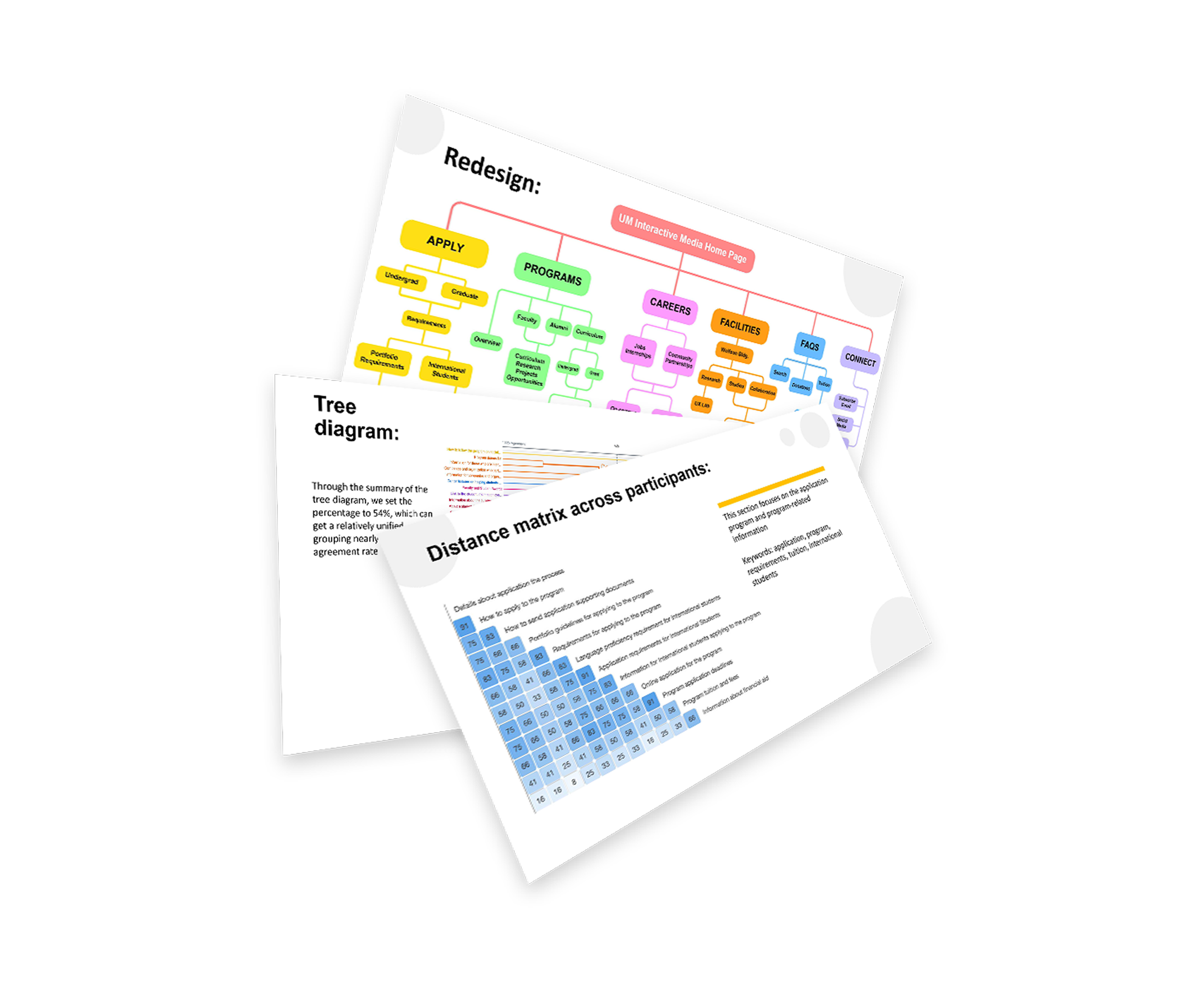
Redesign
After our analysis and observations, our team was ready to begin the redesign process and offer suggestions. Below you will see our low and high fidelity mockups with our visual solution. One of the most suggested comments from the participants was the inclusion of a featured section with student projects, as well as mentioning the virtual and augmented reality specialization section as one of the tracks the students can follow within the program. In the current website, these two things are not mentioned, and we believe those are missed opportunities for prospective students, who want a more in-depth exploration of the program. One last important comment we received was the inclusion of a "featured faculty" that would randomly alternate each time a user visited the website, that way they could get to know the faculty body and read about them, etc.