

Responsibilities:
UX Research
Website Redesign
Timeline:
Summer 2022
Role:
UX Designer
Tools:
Figma
Photoshop
Maze.co
Summary
Over the summer of 2022, I worked at the Gordon Center For Research in Medical Simulation. During my experience, I learned a lot about medical simulation, and how it has evolved throughout the years, as well as its importance in the medical training field. My main project involved redesigning the Gordon Center website via user experience research techniques to inform the design decisions, as well as study the effectiveness of the navigation of the website. Since I was working with established medical content and terminology, the focus was on the hierarchy and flow of the website.
Objectives
Perform a heuristic evaluation to assess and understand overall navigation and user experience of the site, as well as uncover any opportunity for improvement
• Analyze data to help us inform design, plus generate a report to present to the stakeholders
• Perform a tree test study to assess established navigation on the website
• Redesign the products with a new, modern look and feel that communicates the worldwide reach that the Gordon Center has through their products and educators
Heuristics Evaluation
The first step was asking a few questions to the head of the multimedia dept., to establish what their goals are for the website redesign, etc. Over the course of one week, I performed the heuristics evaluation using the 10 heuristic principles created by Jakob Nielsen, this helped me get familiar with the Gordon Center and its mission/vision and programs offered, since I was new there and had no prior knowledge. After the evaluation, I noted all the opportunities found, as well as the good features (or keepers) that the website had and proceeded to generating a report for the design team.
Product Description
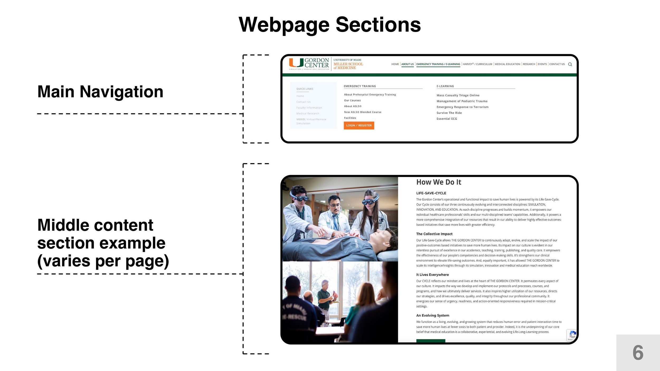
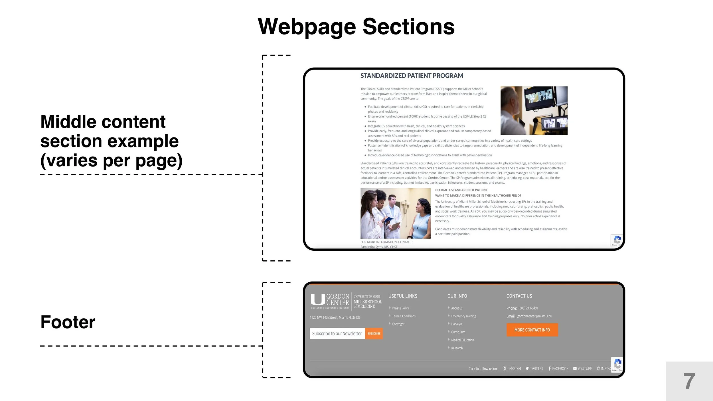
The Gordon Center (GC) is a renowned research center that focuses in Medical training and education via simulation, and is best known for their signature product: Harvey the simulator. They also offer training courses and curricula, including UMedic, and train first respondents, students at the University of Miami, and also international visitors interested in their work. The website’s structure is divided according to the top navigation: some items have sub navigation pages that serve as “anchor” points for all the sections within that given page.
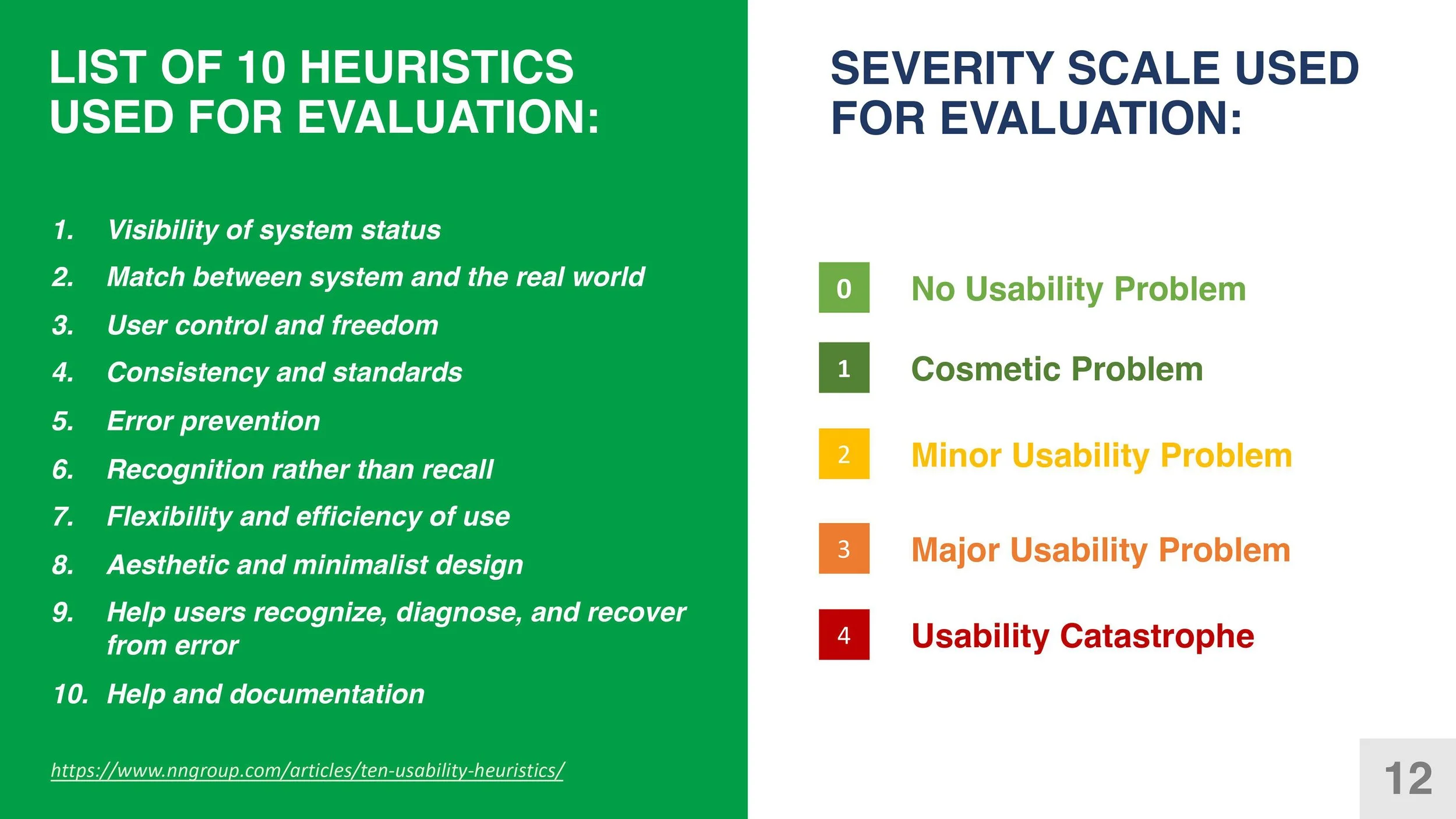
Summary of problems found with the first evaluation
The four photos below show some examples of the highest severity problems encountered; any duplicate problems were merged, and I focused on the highest level issues. This would be pivotal when I moved on the next phase to determine whether the issues I encountered were in fact hindering usability.
Tree Testing
Since the website uses established medical terminology, I originally intended to do a closed card sort study to confirm whether users make sense of the existing labels and sub navigation items, however, after I realized a better approach would be to use another method, tree testing.
I performed the test in a span of one week, using participants who were familiar with the Gordon Center, and its medical terminology and products.
6 tasks were used during the tree test study. All were core functions that the website offered, and were approved by the stakeholder team.
