

Team:
Erik Soriano
Role:
Researcher
UX Designer
Timeline:
1 Week Sprint
Tools:
Qualtrics
Adobe Illustrator
Summary
The purpose of this experiment was to study the impact of icons in mobile applications, and to better understand users’ conceptual models and mind mapping, to uncover any hidden opportunity for the icons of the popular music streaming application: Spotify.
For the purpose of this experiment, only 10 of their icons were selected for the study. The aim was to show each icon individually to each participant (in a randomized order) and out of the context of the app, to assess whether the participant’s conceptual models align with the intent of each icon.
The experiment was conducted over the course of one week, with each participant doing the test unmoderated, and without knowing which app the icons belonged to. Toward the end of the session, participants were then shown all 10 icons together (without labels) and were asked to share their opinions of the icon set as a whole, including asking them to rate the icons from least to most attractive using a Likert scale of 1-7 (with 7 being the most attractive). This was followed by the reveal of which apps the icons belonged to.
Icon Set Used
Results
Key Observations
• The fact that each icon was randomized when being shown to the participant, had no effect on how they perceived it
• After telling each participant that the icons belonged to the music streaming app Spotify, their opinions did not change (except for the two users of the app, who noted that even though they use the app often, they have never paid attention to, nor recognized the music library icon
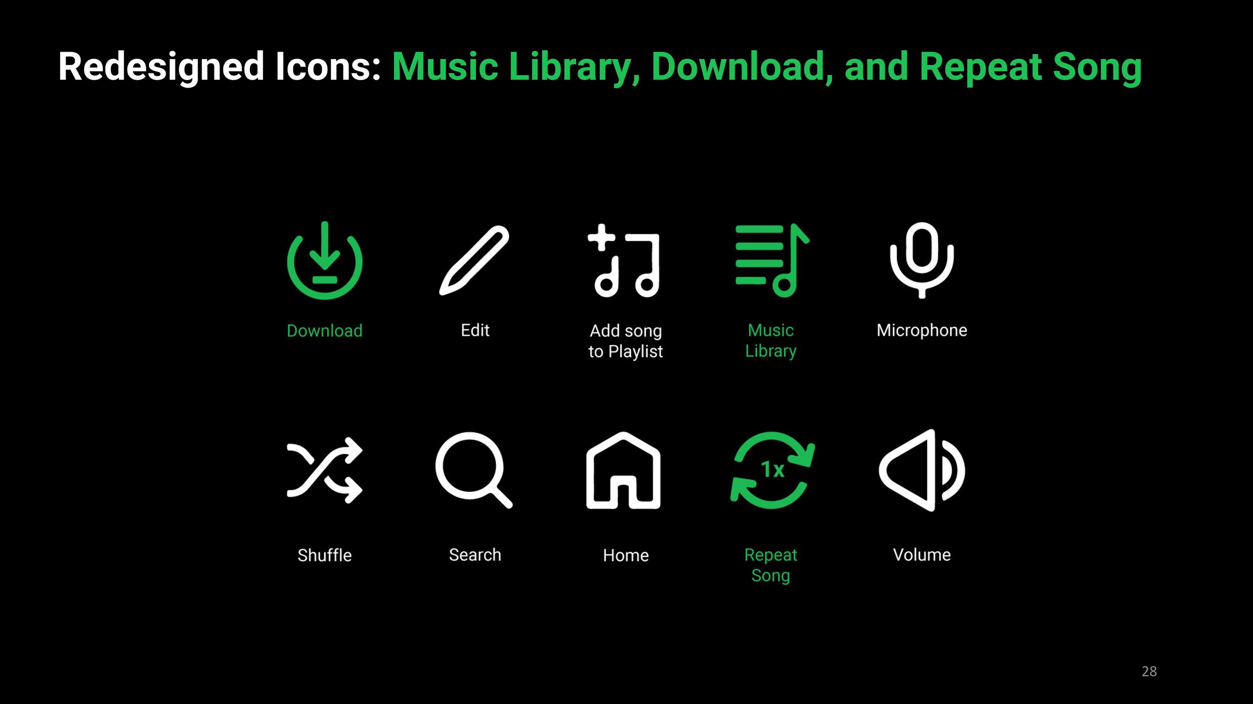
• The music library icon is an opportunity to redesign, since, for most people who are not Spotify users, the icon does not describe its intended meaning, this observation was seen across all participants
• Another opportunity for redesign, is the “repeat song” icon, since most users agreed that it was a “refresh the page” icon, but in the context of the music app, this icon is intended to allow users to repeat a song once, or multiple times, depending on the mode of the icon. Normally an icon like this has an integer in the middle indicating how many times a song can be repeated
Redesigned Icons


Reflection
The key lesson from this experiment is to prioritize universally clear icons, considering users from diverse cultural backgrounds. In the context of creating globally ubiquitous products like Spotify, the right iconography is crucial for a seamless user experience. The experiment suggests that incongruence between icons, information scent, and users' conceptual models can impact usability. If replicated in the future, the focus should be on refining app-exclusive icons, emphasizing cultural relevance and global comprehensibility.